{r ggInterval_boxplot,eval=FALSE} ggInterval_boxplot(facedata, plotAll = T) + theme_bw()
Symbolic data analysis (SDA) is an extension of standard data analysis where symbolic data tables are used as input and symbolic objects are made output as a result. The data units are called symbolic since they are more complex than standard ones, as they not only contain values or categories, but also include internal variation and structure.[1][2]
ggESDA is an extension of ggplot2 for visualizing the symbolic data based on exploratory data analysis (EDA). The package contains many useful graphic techniques functions. Furthermore, the users can also transform the classical data into the symbolic data by the function in this package, which is one of the most important processing in SDA. For the details of the package study, you can see in Jiang and Wu(2022).
It is recommended that download the package on CRAN, although the latest version is always upload to github first. The version in github may exist some bugs that are not fix completely.
The ggESDA package is avaliable on CRAN. The Reference manual and Vignettes can be found there.
install.packages("ggESDA")
or
devtools::install_github("kiangkiangkiang/ggESDA")
After installation, the following steps will illustrate how to use the package. More details (code) about it can be found on vignettes.
The example data is called facedata
[3]. It will be the interval form with minimal
and maximal, known as interval-valued data. However, most of the
symbolic data are not exist at the beginning. Instead, they are usually
aggregated by clustering algorithm from a classical data. Thus, we will
use classic2sym() function to summarize classical data into
symbolic data.
{r library} library(ggESDA)
```{r createData} #aggregated by the variable Species in iris iris_interval_var <- classic2sym(iris, groupby = Species) iris_interval_kmeans <- classic2sym(iris, groupby = “kmeans”) iris_interval_hclust <- classic2sym(iris, groupby = “hclust”)
d <- data.frame(minData = runif(100, 0, 10), maxData = runif(100, 50, 60))
d.sym <- classic2sym(d, groupby = “customize”, minData = d\(minData, maxData = d\)maxData)
#get interval-valued data d.sym$intervalData
## Visualization

With the symbolic data generated, you can start to visualize the data by the following functions:

### ggInterval_index() for visualizing the interval of each observations


<img src = "vignettes/images/ggInterval_index2.png" align = "right"></img>

```{r ggInterval_index,eval=FALSE}
# get the mean value for the hline
m <- mean(facedata$AD)

# build a color mapping for each person
Concepts <- as.factor(rep(c("FRA", "HUS", "INC", "ISA", "JPL", "KHA",
                            "LOT", "PHI", "ROM"), each = 3))

# start plot
ggInterval_index(facedata, aes(x = AD, fill = Concepts))+
  theme_bw() +
  scale_fill_brewer(palette = "Set2")+
  geom_segment(x = m, xend = m, y = 0, yend = 27,
               lty = 2, col = "red", lwd = 1) +
  geom_text(aes(x = m, y = 28), label = "Mean")+
  scale_y_continuous(breaks = 1:27,
                     labels = rownames(facedata))
It can get the preliminary understanding of the interval-valued data.
You can also change fill = and col = to
make the plot more visible, and set x or y axis to your variable will
rotate the index line in figure.
{r ggInterval_minmax,eval=FALSE} ggInterval_minmax(data = NULL, mapping = aes(NULL), scaleXY = "local", plotAll = F)
MMplot is an advanced graphics implemented for symbolic data, or
interval-valued data. It presents the interval by the minimum and
maximum, and shows the difference between each location of concept in
each variable through the 45-degree line. The options
scaleXY = "local" will define the axis limit for the
comparsion.
{r ggInterval_boxplot,eval=FALSE} ggInterval_boxplot(facedata, plotAll = T) + theme_bw()
The side-by-side boxplot clearly shows the difference of variables’ distribution.
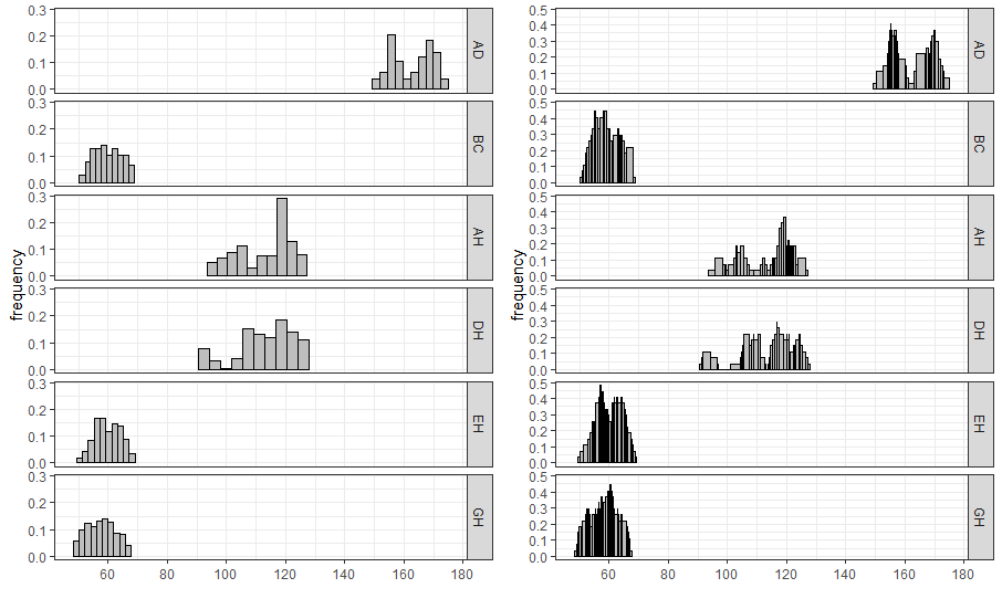
For interval-valued data, not only equidistant-bin histogram but the
Non-equidistant-bin histogram will exhibit the distribution. Use the
option method, and set by equal-bin or
unequal-bin. See the details
Jiang
and Wu(2022).
{r ggInterval_hist,eval=FALSE} equal_bin <- ggInterval_hist(facedata, plotAll = T) + theme_bw() unequal_bin <- ggInterval_hist(facedata, plotAll = T, method = "unequal-bin") + theme_bw() ggarrange(equal_bin, unequal_bin, ncol = 2)
{r ggInterval_minmax,eval=FALSE} ggInterval_centerRange(data = NULL, mapping = aes(NULL), plotAll = F)
Another advanced graphics implemented is called center-range plot, which
helps researchers to be able to grasp the relationship between center
and range.
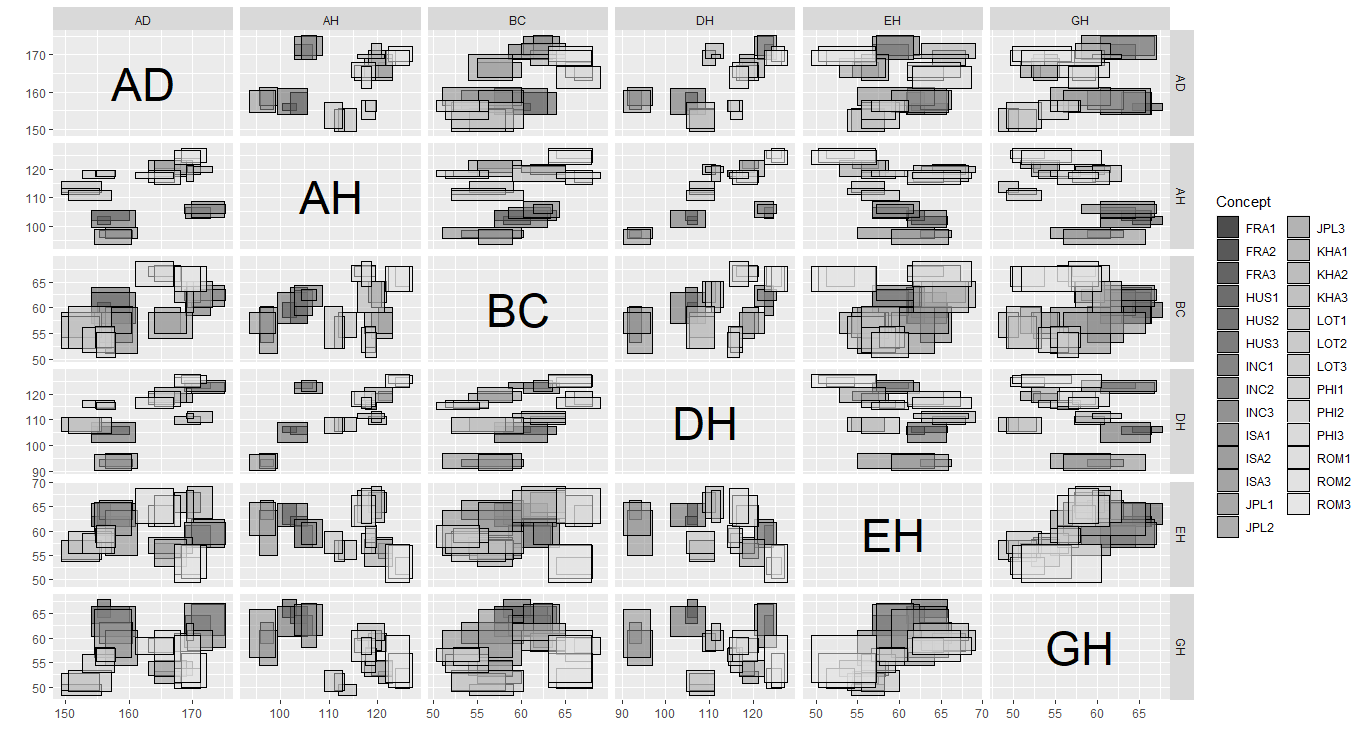
A scatter plot of interval-valued data is presented by a rectangle, which is composed of two interval.
As well, ggInterval_scaMatrix is an extension for visualizing all variables relations by using scatter plot at a time.
{r ggInterval_minmax,eval=FALSE} ggInterval_scaMatrix(facedata)
Another bivariate relationship plot is two-dimension histogram, which is to calculate joint histogram frequency and using matrix visualization to plot.
By the extension, ggInterval_2DhistMatrix is to visualize all variables relations by using 2Dhist plot at a time
{r ggInterval_2DhistMatrix,eval=FALSE} ggInterval_2DhistMatrix(facedata, xBins = 10, yBins = 10, removeZero = T, addFreq = F)
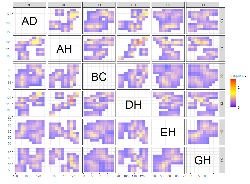
A heatmap type presentation for the interval by the option
plotAll and full_strip. There will be two
distinct type, column condition and matrix condition. See the details
Jiang
and Wu(2022).
```{r ggInterval_indexImage2,eval=FALSE} p1 <- ggInterval_indexImage(facedata, plotAll = T, column_condition = T, full_strip = T)
p2 <- ggInterval_indexImage(facedata, plotAll = T, column_condition = F, full_strip = T)
ggpubr::ggarrange(p1, p2, ncol = 2)
<img src = "vignettes/images/ggInterval_indexImage2.png" width = "75%"></img>
### ggInterval_radar for visualizing the interval of multivariates
One of the most well-known multivariate visualization techniques is radar plot, or called start plot. We fill the interval area by color mapping, and compare CONCEPTs, surely you can arrange it.
In `ggInterval_radar`, you can add any annotations in figure, including a circle for classify the normalize data position, a real value for the interval or a propotion for modal multi-valued variables. There is the most important options `plotPartial`, which define which observations you want to plot. For example, `ggInterval_radar(data = facedata, plotPartial = c(1, 3))`. It means we want to plot the observations whose position of row is at 1 and 3. Remark: A radar plot will visualize all variables you on your input data in one time. If you only want to show the partial variables, just clarify in your input data, ex `data = facedata[, 1:3]`. However, the data you input must have full observations in order to normalize, so an obvious ERROR for input options in data is a `data = facedata[1:5, ]`, which only contains the first five data not a full. Unless you want to make them be your population.
<img src = "vignettes/images/ggInterval_radar.png" width = "75%"></img>
Surely, we always compare the data in the same figure. Just use the color mapping for the different observations.
<img src = "vignettes/images/ggInterval_radar2.png" width = "75%"></img>
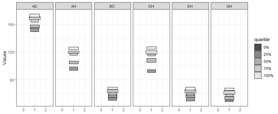
In the field of interval-valued data, the quantile is usually for analysis. We can present the quantiles for each datasets.
<img src = "vignettes/images/ggInterval_radar3.png" width = "75%"></img>
### ggInterval_PCA for dimension reduction in interval data
Two kinds of dimension reduction, see the details <a href="https://github.com/kiangkiangkiang/RESEARCH/blob/master/ggESDA_Jiang&Wu.pdf">Jiang and Wu(2022)</a>, show in following:
```{r ggInterval_radar2,eval=FALSE}
CONCEPT <- rep(c("FRA", "HUS", "INC", "ISA", "JPL", "KHA",
"LOT", "PHI", "ROM"), each = 3)
p <- ggInterval_PCA(facedata, poly = T,
concepts_group = CONCEPT)
p$ggplotPCA <- p$ggplotPCA + theme(legend.position = "top") +
theme_bw()
p2 <- ggInterval_PCA(facedata, poly = F,
concepts_group = CONCEPT)
p2$ggplotPCA <- p2$ggplotPCA + theme(legend.position = "top") +
theme_bw()
ggpubr::ggarrange(p$ggplotPCA, p2$ggplotPCA, ncol = 2)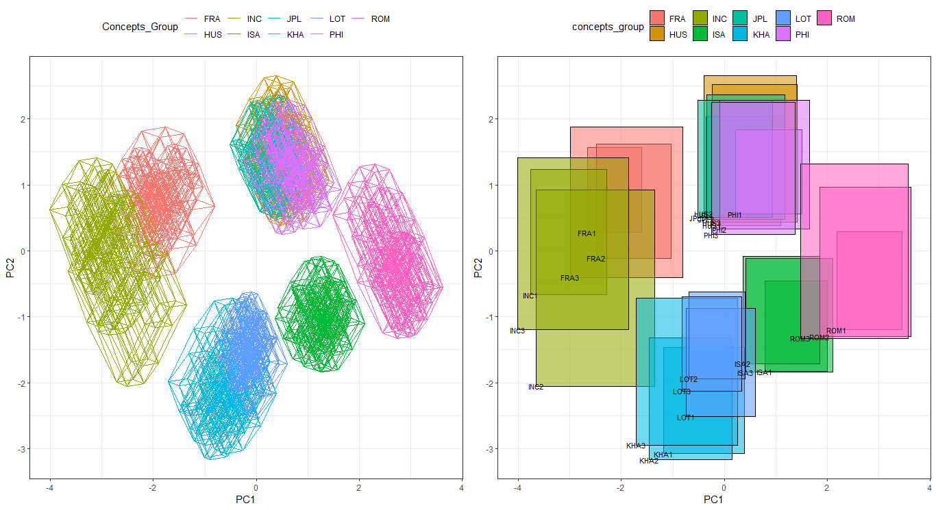
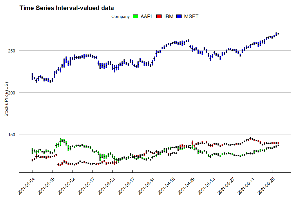
In practice, we can use the technique to visualize financial data,
such as stocks data. We get the stocks price of AAPL, MSFT and IBM from 2021-01-04 to
2021-12-31. Use the function ggInterval_index, and we can
easily present the daily low and high price.
Note: you must specify the classification variable,
whose length is equal to the data you input, in fill
when you want to classify. The classification variable
may not be in your input data frame as the following code
(Company variable is out of the input data
d.i). Each length of the classification factor must be
equal as well.
```{r ts,eval=FALSE} library(data.table) library(ggthemes)
ibm <- fread(“https://query1.finance.yahoo.com/v7/finance/download/IBM?period1=1609459200&period2=1640995200&interval=1d&events=history&includeAdjustedClose=true”) msft <- fread(“https://query1.finance.yahoo.com/v7/finance/download/MSFT?period1=1609459200&period2=1640995200&interval=1d&events=history&includeAdjustedClose=true”) aapl <- fread(“https://query1.finance.yahoo.com/v7/finance/download/AAPL?period1=1609459200&period2=1640995200&interval=1d&events=history&includeAdjustedClose=true”)
d1 <- data.frame(min = ibm[1:124, “Low”], max = ibm[1:124, “High”]) d2 <- data.frame(min = msft[1:124, “Low”], max = msft[1:124, “High”]) d3 <- data.frame(min = aapl[1:124, “Low”], max = aapl[1:124, “High”])
d <- rbind(d1, d2, d3) d.i <- classic2sym(d, groupby = “customize”, minData = d\(min, maxData = d\)max)$intervalData
Company <- rep(c(“IBM”, “MSFT”, “AAPL”), each = 124)
ggInterval_index(d.i, aes(y = V1, fill = Company, group = Company)) + scale_x_continuous(breaks = seq(1, 124, 10), labels = c(ibm[seq(1, 124, 10), 1])$Date)+ labs(x = ““, y =”Stocks Price (US)“, title =”Time Series Interval-valued data”) + scale_fill_manual(values = c(“green”, “red”, “blue”)) + theme_economist_white(gray_bg = FALSE) + theme(axis.text.x = element_text(angle = 45, vjust = 1, hjust=1))
```